About This Website
![]()
![]() In
good MIT fashion, the GSC website has been designed in a very scientific
fashion in all aspects ranging from the layout of content to the way code
is written to the colors used. Attention has been given to issues of accessibility, usability,
standards compliance, aesthetics and sustainability.
In
good MIT fashion, the GSC website has been designed in a very scientific
fashion in all aspects ranging from the layout of content to the way code
is written to the colors used. Attention has been given to issues of accessibility, usability,
standards compliance, aesthetics and sustainability.
Some features of this site are described below. You can also take a look at the site credits to find out who is responsible for creating this website.
Accessibility Features
![]() Website accessibility refers to the ability of different forms of browsing technologies (multiple generations of visual browsers, screen readers, audio browsers, etc.) to effectively view the content on a website. This site has been designed to be as accessible as possible through the following features:
Website accessibility refers to the ability of different forms of browsing technologies (multiple generations of visual browsers, screen readers, audio browsers, etc.) to effectively view the content on a website. This site has been designed to be as accessible as possible through the following features:
- Use of external Cascading Style Sheets (CSS)
- Access keys allow navigation without a mouse
- Page content flows logically so that it is readable without style sheets
- Client side scripts are used minimally on the website
- All content images have descriptive alternate (ALT) text
- All text uses relative font sizes
- Colors selected to provide considerable contrast
- All pages adhere to World Wide Web and Section 508 Accessibility Guidelines
- We have tried to be clear and concise with text
Usability Features
Usability refers to how easy it is to navigate the website and find the information you are looking for. In order to test the usability of this website, MIT Information Systems & Technology (IS&T) has assisted us in performing a number of usability tests, which provided a great deal of useful feedback which was incorporated in the the structure, layout and design of this site. The following usbility features can be found on this site:
- Minimum number of top-level links
- Navigation structure targeted towards MIT students
- No prior knowledge about the GSC or its structure is required to navigate the site
- All pages contain "breadcrumbs" that show the path of navigation
- Search box on every page
- Site map is accessible from all pages
- All pages contain titles and meta descriptions to allow easier understanding of search results
- Colors, fonts, etc. assist the user with navigation and finding important information within a page
Site Credits
The effort to create a coherent, usable and accessible website for the Graduate Student Council began in the Summer of 2002. At that time, the GSC had a website that was rarely visited by anyone because of its unorganized, unintuitive and cluttered navigation and was nearly impossible to maintain. Among the tasks necessary to successfully complete the website project were:
- Organizing the content / creating a sitemap
- Deciding upon a method for long-term content management
- Creating a graphic identity for the GSC
- Implementation - creating the basic templates for use throughout the site
- Testing the site for accessibility, usability, etc.
- Migrating data from the old website to the new one
The effort was led by graduate student David M. Collins, and involved various members of the GSC Executive Committee and IS&T. The main banner for the GSC website was created by graduate student Moneta Ho. Graduate student and GSC Exec Com member Barun Singh designed the new website, which included all of the templates and the color scheme. He also migrated all information from the old website, tested for multiple browser and platform compatibility issues, and performed extensive testing for W3C and accessibility standards.
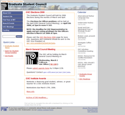
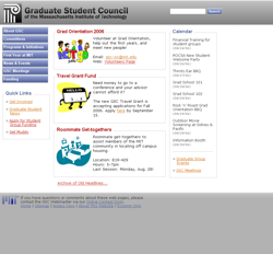
The revamped website (shown below) was publicly launched in late July 2003. By the end of this process, the website was a complete success - visitors to the site had increased tenfold, and it became an essential resource that was also easy to maintain.
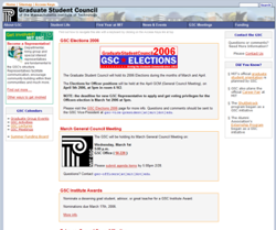
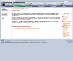
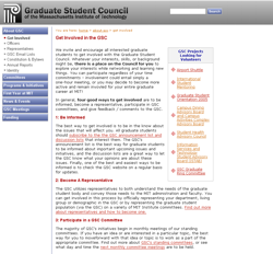
In the Winter of 2006, GSC Webmaster Nici Ames revamped the GSC website look, and added dynamic content to the home page. The officers could now update headlines on the home page from a web browser, instead of having to log in to Athena to update static code. Additionaly, an RSS feed for all GSC sponsored events was created and displayed on the home page. The new pages are shown below.
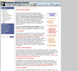
In the Summer 2006, the site navigation was restructured by the current Excomm, and the style of the pages were once again updated by Nici. Some example pages are below.

