MenuItem QML Type
MenuItem provides an item to add in a menu or a menu bar. More...
| Import Statement: | import QtQuick.Controls 1.4 |
Properties
- action : Action
- checkable : bool
- checked : bool
- enabled : bool
- exclusiveGroup : ExclusiveGroup
- iconName : string
- iconSource : url
- shortcut : keysequence
- text : string
- type : enumeration
- visible : bool
Signals
Methods
- void trigger()
Detailed Description

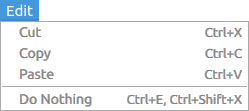
  Menu {
      text: "Edit"

      MenuItem {
          text: "Cut"
          shortcut: "Ctrl+X"
          onTriggered: ...
      }

      MenuItem {
          text: "Copy"
          shortcut: "Ctrl+C"
          onTriggered: ...
      }

      MenuItem {
          text: "Paste"
          shortcut: "Ctrl+V"
          onTriggered: ...
      }
  }
See also MenuBar, Menu, MenuSeparator, and Action.
Property Documentation
action : Action |
The action bound to this menu item. It will provide values for all the properties of the menu item. However, it is possible to override the action's text, iconSource, and iconName properties by just assigning these properties, allowing some customization.
In addition, the menu item triggered() and toggled() signals will not be emitted. Instead, the action triggered() and toggled() signals will be.
Defaults to null, meaning no action is bound to the menu item.
Whether the menu item can be checked, or toggled. Defaults to false.
See also checked.
If the menu item is checkable, this property reflects its checked state. Defaults to false.
See also checkable and Action::toggled.
Whether the menu item is enabled, and responsive to user interaction. Defaults to true.
exclusiveGroup : ExclusiveGroup |
If a menu item is checkable, an ExclusiveGroup can be attached to it. All the menu items sharing the same exclusive group, and by extension, any Action sharing it, become mutually exclusive selectable, meaning that only the last checked menu item will actually be checked.
Defaults to null, meaning no exclusive behavior is to be expected.
Sets the icon name for the MenuItem icon. This will pick the icon with the given name from the current theme. Overrides the item's bound action iconName property. Defaults to the empty string.
See also iconSource and Action::iconName.
iconSource : url |
Sets the icon file or resource url for the MenuItem icon. Overrides the item's bound action iconSource property. Defaults to the empty URL.
See also iconName and Action::iconSource.
Shortcut bound to the menu item. The keysequence can be a string or a standard key.
Defaults to an empty string.
  MenuItem {
      id: copyItem
      text: qsTr("&Copy")
      shortcut: StandardKey.Copy
  }
See also Action::shortcut.
Text for the menu item. Overrides the item's bound action text property.
Mnemonics are supported by prefixing the shortcut letter with &. For instance, "\&Open" will bind the Alt-O shortcut to the "Open" menu item. Note that not all platforms support mnemonics.
Defaults to the empty string.
See also Action::text.
This property is read-only and constant, and its value is MenuItemType.Item.
Signal Documentation
Emitted whenever a menu item's checked property changes. This usually happens at the same time as triggered.
The corresponding handler is onToggled.
See also checked, triggered, Action::triggered, and Action::toggled.
Emitted when either the menu item or its bound action have been activated.
The corresponding handler is onTriggered.
See also trigger(), Action::triggered, and Action::toggled.
Method Documentation
Manually trigger a menu item. Will also trigger the item's bound action.
See also triggered and Action::trigger().