An icon is a graphic that takes up a small portion of screen real estate and provides a quick, intuitive representation of an action, a status, or an app.
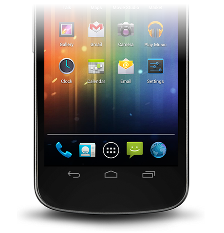
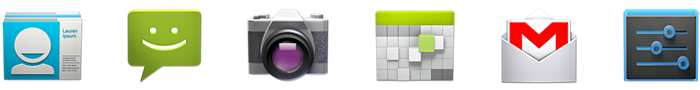
Launcher
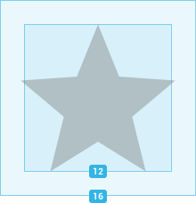
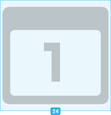
The launcher icon is the visual representation of your app on the Home or All Apps screen. Since the user can change the Home screen's wallpaper, make sure that your launcher icon is clearly visible on any type of background.

Sizes & scale
Proportions
Style
Use a distinct silhouette. Three-dimensional, front view, with a slight perspective as if viewed from above, so that users perceive some depth.
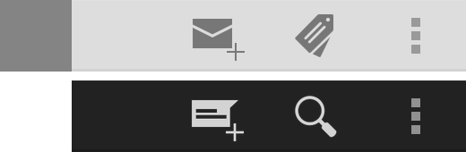
Action Bar
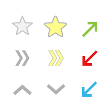
Action bar icons are graphic buttons that represent the most important actions people can take within your app. Each one should employ a simple metaphor representing a single concept that most people can grasp at a glance.
Pre-defined glyphs should be used for certain common actions such as "refresh" and "share." The download link below provides a package with icons that are scaled for various screen densities and are suitable for use with the Holo Light and Holo Dark themes. The package also includes unstyled icons that you can modify to match your theme, in addition to Adobe® Illustrator® source files for further customization.
Download the Action Bar Icon Pack


Sizes & scale
Focal area & proportions
Style
Pictographic, flat, not too detailed, with smooth curves or sharp shapes. If the graphic is thin, rotate it 45° left or right to fill the focal space. The thickness of the strokes and negative spaces should be a minimum of 2 dp.
Colors
Colors: #333333
Enabled: 60% opacity
Disabled: 30% opacity
Colors: #FFFFFF
Enabled: 80% opacity
Disabled: 30% opacity
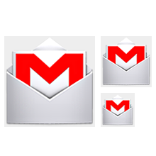
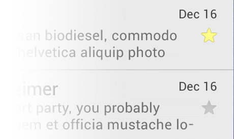
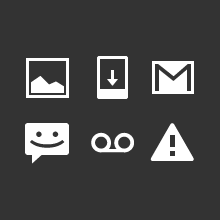
Small / Contextual Icons
Within the body of your app, use small icons to surface actions and/or provide status for specific items. For example, in the Gmail app, each message has a star icon that marks the message as important.

Sizes & scale
Focal area & proportions
Style
Neutral, flat, and simple. Filled shapes are easier to see than thin strokes. Use a single visual metaphor so that a user can easily recognize and understand its purpose.
Colors
Use non-neutral colors sparingly and with purpose. For example, Gmail uses yellow in the star icon to indicate a bookmarked message. If an icon is actionable, choose a color that contrasts well with the background.
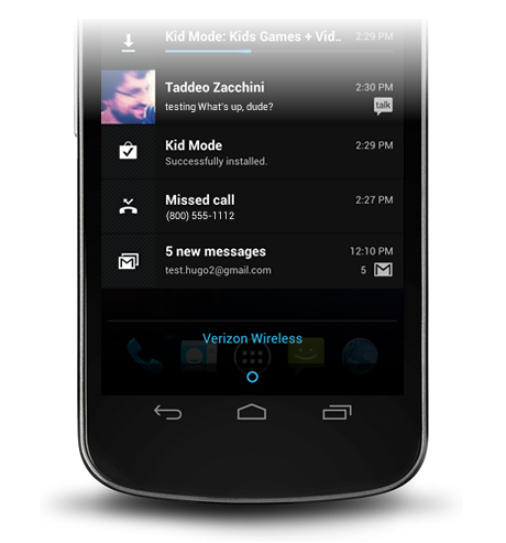
Notification Icons
If your app generates notifications, provide an icon that the system can display in the status bar whenever a new notification is available.

Sizes & scale
Focal area & proportions
Style
Keep the style flat and simple, using the same single, visual metaphor as your launcher icon.
Colors
Notification icons must be entirely white. Also, the system may scale down and/or darken the icons.