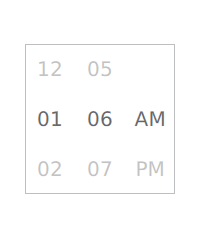
Tumbler QML Type
A spinnable wheel of items that can be selected. More...
| Import Statement: | import QtQuick.Controls 2.0 |
| Since: | Qt 5.7 |
| Inherits: |
Properties
- count : int
- currentIndex : int
- currentItem : Item
- delegate : component
- model : variant
- visibleItemCount : int
Attached Properties
- displacement : real
- tumbler : Tumbler
Detailed Description
  Tumbler {
      model: 5
      // ...
  }
Non-wrapping Tumbler
The default contentItem of Tumbler is a PathView, which wraps when it reaches the top and bottom. To achieve a non-wrapping Tumbler, use ListView as the contentItem:
  Tumbler {
      id: listViewTumbler

      contentItem: ListView {
          anchors.fill: parent
          model: listViewTumbler.model
          delegate: listViewTumbler.delegate

          snapMode: ListView.SnapToItem
          highlightRangeMode: ListView.StrictlyEnforceRange
          preferredHighlightBegin: height / 2 - (height / listViewTumbler.visibleItemCount / 2)
          preferredHighlightEnd: height / 2  + (height / listViewTumbler.visibleItemCount / 2)
          clip: true
      }
  }
See also Customizing Tumbler and Input Controls.
Property Documentation
[read-only] currentItem : Item |
This property holds the item at the current index.
model : variant |
This property holds the model that provides data for this tumbler.
This property holds the number of items visible in the tumbler. It must be an odd number, as the current item is always vertically centered.
Attached Property Documentation
This attached property holds a value from -visibleItemCount / 2 to visibleItemCount / 2, which represents how far away this item is from being the current item, with 0 being completely current.
For example, the item below will be 40% opaque when it is not the current item, and transition to 100% opacity when it becomes the current item:
  delegate: Text {
      text: modelData
      opacity: 0.4 + Math.max(0, 1 - Math.abs(Tumbler.displacement)) * 0.6
  }
[read-only] Tumbler.tumbler : Tumbler |
This attached property holds the tumbler. The property can be attached to a tumbler delegate. The value is null if the item is not a tumbler delegate.