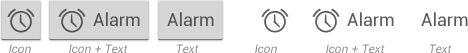
A button consists of text and/or an image that clearly communicates what action will occur when the user touches it. Android supports two different types of buttons: basic buttons and borderless buttons. Both can contain text labels and/or images.
Basic Buttons
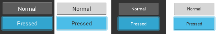
Basic buttons are traditional buttons with borders and background. Android supports two styles for basic buttons: default and small. Default buttons have slightly larger font size and are optimized for display outside of form content. Small buttons are intended for display alongside other content. They have a smaller font and smaller minimum height. Use small buttons in forms where they need to align with other UI elements.
Borderless Buttons
Borderless buttons resemble basic buttons except that they have no borders or background. You can use borderless buttons with both icons and text. Borderless buttons are visually more lightweight than basic buttons and integrate nicely with other content.
Developer Guide
For information about how to build and customize buttons in your app, see the Buttons API guide.