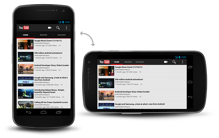
Tabs in the action bar make it easy to explore and switch between different views or functional aspects of your app, or to browse categorized data sets.
For details on using gestures to move between tabs, see the Swipe Views pattern.
Scrollable Tabs
Scrolling tab controls can contain a larger number of items than a standard tab control. To navigate to the next/previous view, swipe left or right.
Fixed Tabs
Fixed tabs display all items concurrently. To navigate to a different view, touch the tab, or swipe left or right.
Fixed tabs are displayed with equal width, based on the width of the widest tab label. If there is insufficient room to display all tabs, the tab labels themselves will be scrollable. For this reason, fixed tabs are best suited for displaying 3 or fewer tabs.


Stacked Tabs
If view navigation is essential to your app, you can break out tabs into a separate action bar. This permits fast view switching even on narrower screens.

Developer Guide
For information about how to create tabs, see the Action Bar API guide.