When writing an app for Android, keep in mind that Android devices come in many different screen sizes and types. Make sure that your app consistently provides a balanced and aesthetically pleasing layout by adjusting its content to varying screen sizes and orientations.
Panels are a great way for your app to achieve this. They allow you to combine multiple views into one compound view when a lot of horizontal screen real estate is available and by splitting them up when less space is available.
Combining Multiple Views Into One
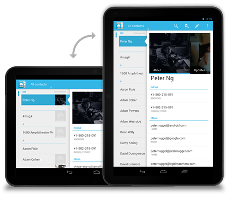
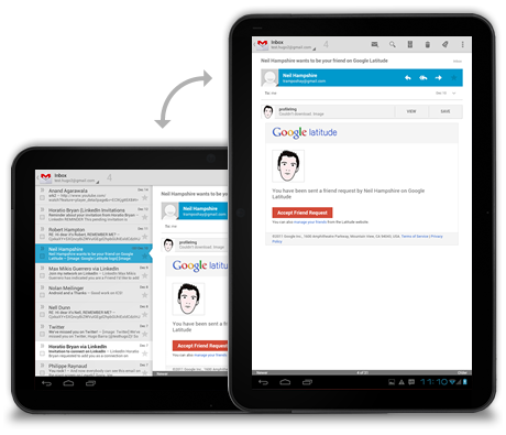
On smaller devices your content is typically divided into a master grid or list view and a detail view. Touching an item in the master view opens a different screen showing that item's detail information.
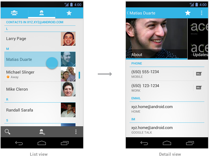
Because tablets have more screen real estate than phones, you can use panels to combine the related list and detail views into a single compound view. This uses the additional space more efficiently and makes navigating the app easier.
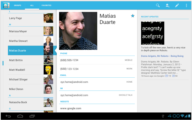
In general, use the pane on the right to present more information about the item you selected in the left pane. Make sure to keep the item in the left pane selected in order to establish the relationship between the panels.
Compound Views and Orientation Changes
Screens should strive to have the same functionality regardless of orientation. If you use a compound view in one orientation, try not to split it up when the user rotates the screen. There are several techniques you can use to adjust the layout after orientation change while keeping functional parity intact.
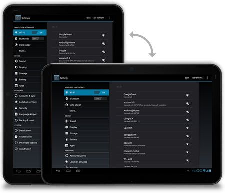
Stretch/compress
Adjust the column width of your left pane to achieve a balanced layout in both orientations.
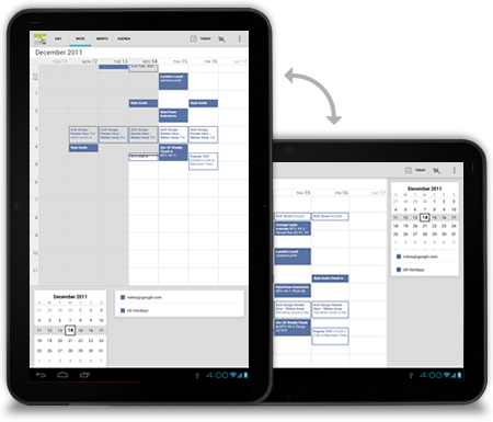
Stack
Rearrange the panels on your screen to match the orientation.
Expand/collapse
When the device rotates, collapse the left pane view to only show the most important information.
Show/hide
If your screen cannot accommodate the compound view on rotation show the right pane in full screen view on rotation to portrait. Use the Up icon in action bar to show the parent screen.
Developer Guide
For information about how to create multi-pane layouts, read see the Building a Dynamic UI with Fragments and Designing for Multiple Screens.
Checklist
-
Plan in advance on how your app scales to different screen sizes and screen orientations.
-
Identify the most appropriate method for the panels in your compound views to reorganize themselves when screen orientation changes.
-
Look for opportunities to consolidate your views into multi-panel compound views.
-
Make sure that your screens try to provide functional parity after the screen orientation changes.