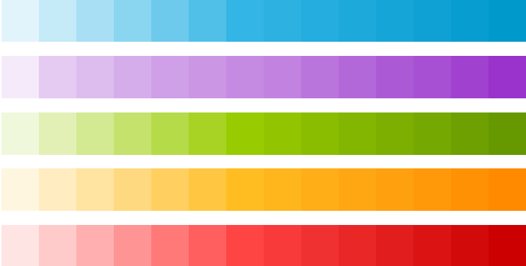
Use color primarily for emphasis. Choose colors that fit with your brand and provide good contrast between visual components. Note that red and green may be indistinguishable to color-blind users.
- #33b5e5
- #aa66cc
- #99cc00
- #ffbb33
- #ff4444
- #0099cc
- #9933cc
- #669900
- #ff8800
- #cc0000
Palette
Blue is the standard accent color in Android's color palette. Each color has a corresponding darker shade that can be used as a complement when needed.
