Checklist
- 1. Test for Core App Quality
- 2. Optimize your layouts
- 3. Use the extra screen area
- 4. Use assets designed for tablets
- 5. Adjust fonts and touch targets
- 6. Adjust homescreen widgets
- 7. Offer the app's full feature set
- 8. Don’t require hardware features
- 9. Declare tablet screen support
- 10. Follow best practices for publishing in Google Play
Testing
Before you publish an app on Google Play, it's important to make sure that the app meets the basic expectations of tablet users through compelling features and an intuitive, well-designed UI.
Tablets are a growing part of the Android installed base that offers new opportunities for user engagement and monetization. If your app is targeting tablet users, this document helps you focus on key aspects of quality, feature set, and UI that can have a significant impact on the app's success. Each focus area is given as checklist item, with each one comprising several smaller tasks or best practices.
Although the checklist tasks below are numbered for convenience, you can handle them in any order and address them to the extent that you feel is right for your app. In the interest of delivering the best possible product to your customers, follow the checklist recommendations to the greatest extent possible.
As you move through the checklist, you'll find links to support resources that can help you address the topics raised in each task.
1. Test for Core App Quality
The first step in delivering a great tablet app experience is making sure that it meets the core app quality criteria for all of the devices and form factors that the app is targeting. For complete information, see the Core App Quality Checklist.
To assess the quality of your app on tablets — both for core app quality and tablet app quality — you need to set up a suitable hardware or emulator environment for testing. For more information, see Setting Up a Test Environment.
Related resources:
|
2. Optimize your layouts for larger screens
Android makes it easy to develop an app that runs well on a wide range of device screen sizes and form factors. This broad compatibility works in your favor, since it helps you design a single app that you can distribute widely to all of your targeted devices. However, to give your users the best possible experience on each screen configuration — in particular on tablets — you need to optimize your layouts and other UI components for each targeted screen configuration. On tablets, optimizing your UI lets you take full advantage of the additional screen available, such as to offer new features, present new content, or enhance the experience in other ways to deepen user engagement.
If you developed your app for handsets and now want to distribute it to tablets, you can start by making minor adjustments to your layouts, fonts, and spacing. In some cases — such as for 7-inch tablets or for a game with large canvas — these adjustments may be all you need to make your app look great. In other cases, such as for larger tablets, you can redesign parts of your UI to replace "stretched UI" with an efficient multipane UI, easier navigation, and additional content.
Here are some suggestions:
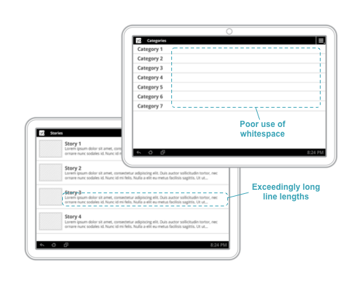
Get rid of "stretched" UI: On tablets, single-pane layouts lead to awkward whitespace and excessive line lengths. Use padding to reduce the width of UI elements and consider using multi-pane layouts.
- Provide custom layouts as needed for
largeandxlargescreens. You can also provide layouts that are loaded based on the screen's shortest dimension or the minimum available width and height. - At a minimum, customize dimensions such as font sizes, margins, spacing for larger screens, to improve use of space and content legibility.
- Adjust positioning of UI controls so that they are easily accessible to users when holding a tablet, such as toward the sides when in landscape orientation.
- Padding of UI elements should normally be larger on tablets than on handsets. A 48dp rhythm (and a 16dp grid) is recommended.
- Adequately pad text content so that it is not aligned directly along screen edges.
Use a minimum
16dppadding around content near screen edges.
In particular, make sure that your layouts do not appear "stretched" across the screen:
- Lines of text should not be excessively long — optimize for a maximum 100 characters per line, with best results between 50 and 75.
- ListViews and menus should not use the full screen width.
- Use padding to manage the widths of onscreen elements or switch to a multi-pane UI for tablets (see next section).
Related resources:
|
3. Take advantage of extra screen area available on tablets
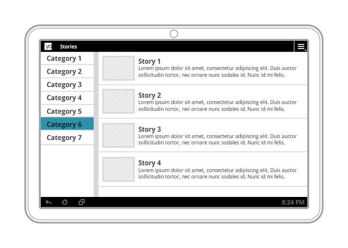
Multi-pane layouts result in a better visual balance on tablet screens, while offering more utility and legibility.
Tablet screens provide significantly more screen real estate to your app, especially when in landscape orientation. In particular, 10-inch tablets offer a greatly expanded area, but even 7-inch tablets give you more space for displaying content and engaging users.
As you consider the UI of your app when running on tablets, make sure that it is taking full advantage of extra screen area available on tablets. Here are some suggestions:
- Look for opportunities to include additional content or use an alternative treatment of existing content.
- Use multi-pane layouts on tablet screens to combine single views into a compound view. This lets you use the additional screen area more efficiently and makes it easier for users to navigate your app.
- Plan how you want the panels of your compound views to reorganize when screen orientation changes.
- While a single screen is implemented as an
Activitysubclass, consider implementing individual content panels asFragmentsubclasses. This lets you maximize code reuse across different form factors and across screens that share content. - Decide on which screen sizes you'll use a multi-pane UI, then provide the
different layouts in the appropriate screen size buckets (such as
large/xlarge) or minimum screen widths (such assw600dp/sw720).

Compound views combine several single views from a handset UI (above) into a richer, more efficient UI for tablets (below).
Related resources:
|
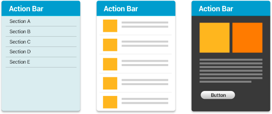
4. Use Icons and other assets that are designed for tablet screens
So that your app looks its best, make sure to use icons and other bitmap assets that are created specifically for the densities used by tablet screens. Specifically, you should create sets of alternative bitmap drawables for each density in the range commonly supported by tablets.
Table 1. Raw asset sizes for icon types.
| Density | Launcher | Action Bar | Small/Contextual | Notification |
|---|---|---|---|---|
mdpi |
48x48px | 32x32px | 16x16px | 24x24px |
hdpi |
72x72px | 48x48px | 24x24px | 36x36px |
tvdpi |
(use hdpi) | (use hdpi) | (use hdpi) | (use hdpi) |
xhdpi |
96x96px | 64x64px | 32x32px | 48x48px |
Other points to consider:
- Icons in the action bar, notifications, and launcher should be designed according to the icon design guidelines and have the same physical size on tablets as on phones.
- Use density-specific resource qualifiers to ensure that the proper set of alternative resources gets loaded.
Related resources:
|
5. Adjust font sizes and touch targets for tablet screens
To make sure your app is easy to use on tablets, take some time to adjust the font sizes and touch targets in your tablet UI, for all of the screen configurations you are targeting. You can adjust font sizes through styleable attributes or dimension resources, and you can adjust touch targets through layouts and bitmap drawables, as discussed above.
Here are some considerations:
- Text should not be excessively large or small on tablet screen sizes and densities. Make sure that labels are sized appropriately for the UI elements they correspond to, and ensure that there are no improper line breaks in labels, titles, and other elements.
- The recommended touch-target size for onscreen elements is 48dp (32dp minimum) — some adjustments may be needed in your tablet UI. Read Metrics and Grids to learn about implementation strategies to help most of your users. To meet the accessibility needs of certain users, it may be appropriate to use larger touch targets.
- When possible, for smaller icons, expand the touchable area to more than
48dp using
TouchDelegateor just centering the icon within the transparent button.
Related resources:
|
6. Adjust sizes of home screen widgets for tablet screens
If your app includes a home screen widget, here are a few points to consider to ensure a great user experience on tablet screens:
- Make sure that the widget's default height and width are set appropriately for tablet screens, as well as the minimum and maximum resize height and width.
- The widget should be resizable to 420dp or more, to span 5 or more home screen rows (if this is a vertical or square widget) or columns (if this is a horizontal or square widget).
- Make sure that 9-patch images render correctly.
- Use default system margins.
- Set the app's
targetSdkVersionto 14 or higher, if possible.
Related resources:
|
7. Offer the app's full feature set to tablet users
Let your tablet users experience the best features of your app. Here are some recommendations:
- Design your app to offer at least the same set of features on tablets as it does on handsets.
- In exceptional cases, your app might omit or replace certain features on
tablets if they are not supported by the hardware or use-case of most tablets.
For example:
- If the handset uses telephony features but telephony is not available on the current tablet, you can omit or replace the related functionality.
- Many tablets have a GPS sensor, but most users would not normally carry their tablets while running. If your phone app provides functionality to let the user record a GPS track of their runs while carrying their phones, the app would not need to provide that functionality on tablets because the use-case is not compelling.
- If you will omit a feature or capability from your tablet UI, make sure that it is not accessible to users or that it offers “graceful degradation” to a replacement feature (also see the section below on hardware features).
8. Don’t require hardware features that might not be available on tablets
Handsets and tablets typically offer slightly different hardware support for sensors, camera, telephony, and other features. For example, many tablets are available in a "Wi-Fi" configuration that does not include telephony support.
To ensure that you can deliver a single APK broadly across the your full customer base, make sure that your app does not have built-in requirements for hardware features that aren't commonly available on tablets.
- Your app's manifest should not include
<uses-feature>elements for hardware features or capabilities that might not be available on tablets, except when they are declared with theandroid:required=”false”attribute. For example, your app should not require features such as:android.hardware.telephonyandroid.hardware.camera(refers to back camera), orandroid.hardware.camera.front
- Similarly, your app manifest should not include any
<permission>elements that imply feature requirements that might not be appropriate for tablets, except when accompanied by a corresponding<uses-feature>element declared with theandroid:required=”false”attribute.
In all cases, the app must function normally when the hardware features it uses are not available and should offer “graceful degradation” and alternative functionality where appropriate. For example, if GPS is not supported on the device, your app could let the user set their location manually. The app should do run-time checking for the hardware capability that it needs and handle as needed.
Related resources:
|
9. Declare support for tablet screen configurations
To ensure that you can distribute your app to a broad range of tablets, declare all the screen sizes that your app supports in its manifest:
- Declare a
<supports-screens>element with appropriate attributes, as needed. - If the app declares a
<compatible-screens>element in the manifest, the element must include attributes that specify all of the size and density combinations for tablet screens that the app supports. Note that, if possible, you should avoid using this element in your app.
Related resources:
|
10. Follow best practices for publishing in Google Play
- Publish your app as a single APK for all screen sizes (handsets
and tablets), with a single Google Play listing:
- Easier for users to find your app from search, browsing, or promotions
- Easier for users to restore your app automatically if they get a new device.
- Your ratings and download stats are consolidated across all devices.
- Publishing a tablet app in a second listing can dilute ratings for your brand.
- If necessary, you can alternatively choose to deliver your app using Multiple APK Support, although in most cases using a single APK to reach all devices is strongly recommended.
- Highlight your app’s tablet capabilities in the product details page:
- Add at least one screenshot taken while the app is running on a tablet. It's recommended that you add one screenshot of landscape orientation and one of portrait orientation, if possible. These screenshots make it clear to users that your app is designed for tablets and highlight all the effort you've put into designing a great tablet app experience.
- Mention tablet support in the app description.
- Include information about tablet support in the app's release notes and update information.
- In your app's promo video, add shots of your app running on a tablet.
- Make sure you are distributing to tablet devices. Check the app's Supported Devices list in the Developer Console to make sure your app is not filtered from tablet devices that you want to target.
- Let tablet users know about your app! Plan a marketing or advertising campaign that highlights the use of your app on tablets.
Related resources:
|
Setting Up a Test Environment for Tablets
To assess the quality of your app on tablets — both for core app quality and tablet app quality — you need to set up a suitable hardware or emulator environment for testing.
The ideal test environment would include a small number of actual hardware devices that represent key form factors and hardware/software combinations currently available to consumers. It's not necessary to test on every device that's on the market — rather, you should focus on a small number of representative devices, even using one or two devices per form factor. The table below provides an overview of devices you could use for testing.
If you are not able to obtain actual hardware devices for testing, you should set up emulated devices (AVDs) to represent the most common form factors and hardware/software combinations. See the table below for suggestions on the emulator configurations to use.
To go beyond basic testing, you can add more devices, more form factors, or new hardware/software combinations to your test environment. For example, you could include mid-size tablets, tablets with more or fewer hardware/software features, and so on. You can also increase the number or complexity of tests and quality criteria.
Table 1. A typical tablet test environment might include one or two devices from each row in the table below, with one of the listed chipsets, platform versions, and hardware feature configurations.
| Type | Size | Density | Version | AVD Skin |
|---|---|---|---|---|
| 7-inch tablet | large or-sw600 |
hdpi,tvdpi |
Android 4.0+ | WXGA800-7in |
| 10-inch tablet | xlarge or-sw800 |
mdpi,hdpi |
Android 3.2+ | WXGA800 |