This lesson teaches you to
- Group Screens with Multi-pane Layouts
- Design for Multiple Tablet Orientations
- Group Screens in the Screen Map
You should also read
The exhaustive screen map from the previous lesson isn't tied to a particular device form factor, although it can generally look and work okay on a handset or similar-size device. But Android applications need to adapt to a number of different types of devices, from 3" handsets to 10" tablets to 42" TVs. In this lesson we explore reasons and tactics for grouping together multiple screens from the exhaustive map.
Note: Designing applications for television sets also requires attention to other factors, including interaction methods (i.e., the lack of a touch screen), legibility of text at large reading distances, and more. Although this discussion is outside the scope of this class, you can find more information on designing for TVs in the Google TV documentation for design patterns.
Group Screens with Multi-pane Layouts
Multi-pane Layout Design
For design guidelines, read Android Design's Multi-pane Layouts pattern guide.
3 to 4-inch screens are generally only suitable for showing a single vertical pane of content at a time, be it a list of items, or detail information about an item, etc. Thus on such devices, screens generally map one-to-one with levels in the information hierarchy (categories → object list → object detail).
Larger screens such as those found on tablets and TVs, on the other hand, generally have much more available screen space and are able to present multiple panes of content. In landscape, panes are usually ordered from left to right in increasing detail order. Users are especially accustomed to multiple panes on larger screens from years and years of desktop application and desktop web site use. Many desktop applications and websites offer a left-hand navigation pane or use a master/detail two-pane layout.
In addition to addressing these user expectations, it's usually necessary to provide multiple panes of information on tablets to avoid leaving too much whitespace or unwittingly introducing awkward interactions, for example 10 x 0.5-inch buttons.
The following figures demonstrate some of the problems that can arise when moving a UI (user interface) design into a larger layout and how to address these issues with multi-pane layouts:
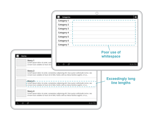
Figure 1. Single pane layouts on large screens in landscape lead to awkward whitespace and exceedingly long line lengths.
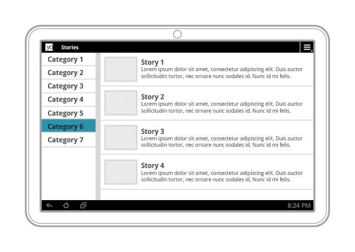
Figure 2. Multi-pane layouts in landscape result in a better visual balance while offering more utility and legibility.
Implementation Note: After deciding on the screen size at which to draw the line between single-pane and multi-pane layouts, you can provide different layouts containing one or multiple panes for devices in varying screen size buckets (such as large/xlarge) or varying minimum screen widths (such as sw600dp).
Implementation Note: While a single screen is implemented as an Activity subclass, individual content panes can be implemented as Fragment subclasses. This maximizes code re-use across different form factors and across screens that share content.
Design for Multiple Tablet Orientations
Although we haven't begun arranging user interface elements on our screens yet, this is a good time to consider how your multi-pane screens will adapt to different device orientations. Multi-pane layouts in landscape work quite well because of the large amount of available horizontal space. However, in the portrait orientation, your horizontal space is more limited, so you may need to design a separate layout for this orientation.
Below are a few common strategies for creating portrait tablet layouts.
- Stretch

The most straightforward strategy is to simply stretch each pane's width to best present the content in each pane in the portrait orientation. Panes could have fixed widths or take a certain percentage of the available screen width.
- Expand/collapse

A variation on the stretch strategy is to collapse the contents of the left pane when in portrait. This works quite well with master/detail panes where the left (master) pane contains easily collapsible list items. An example would be for a realtime chat application. In landscape, the left list could contain chat contact photos, names, and online statuses. In portrait, horizontal space could be collapsed by hiding contact names and only showing photos and online status indicator icons. Optionally also provide an expand control that allows the user to expand the left pane content to its larger width and vice versa.
- Show/Hide

In this scenario, the left pane is completely hidden in portrait mode. However, to ensure the functional parity of your screen in portrait and landscape, the left pane should be made available via an onscreen affordance (such as a button). It's usually appropriate to use the Up button in the Action Bar (pattern docs at Android Design) to show the left pane, as is discussed in a later lesson.
- Stack
The last strategy is to vertically stack your normally horizontally-arranged panes in portrait. This strategy works well when your panes aren't simple text-based lists, or when there are multiple blocks of content running along the primary content pane. Be careful to avoid the awkward whitespace problem discussed above when using this strategy.
Group Screens in the Screen Map
Now that we are able to group individual screens together by providing multi-pane layouts on larger-screen devices, let's apply this technique to our exhaustive screen map from the previous lesson to get a better sense of our application's hierarchy on such devices:
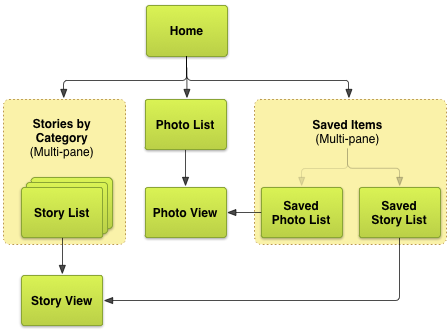
Figure 3. Updated example news application screen map for tablets.
In the next lesson we discuss descendant and lateral navigation, and explore more ways of grouping screens to maximize the intuitiveness and speed of content access in the application's user interface.