This lesson teaches you about:
You should also read
One way of providing access to the full range of an application's screens is to expose hierarchical navigation. In this lesson we discuss descendant navigation, allowing users to descend 'down' a screen hierarchy into a child screen, and lateral navigation, allowing users to access sibling screens.
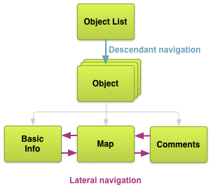
Figure 1. Descendant and lateral navigation.
There are two types of sibling screens: collection-related and section-related screens. Collection-related screens represent individual items in the collection represented by the parent. Section-related screens represent different sections of information about the parent. For example, one section may show textual information about an object while another may provide a map of the object's geographic location. The number of section-related screens for a given parent is generally small.
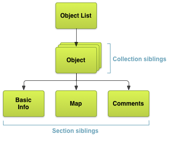
Figure 2. Collection-related children and section-related children.
Descendant and lateral navigation can be provided using lists, tabs, and other user interface patterns. User interface patterns, much like software design patterns, are generalized, common solutions to recurring interaction design problems. We explore a few common lateral navigation patterns in the sections below.
Buttons and Simple Targets
Button Design
For design guidelines, read Android Design's Buttons guide.
For section-related screens, offering touchable and keyboard-focusable targets in the parent is generally the most straightforward and familiar kind of touch-based navigation interface. Examples of such targets include buttons, fixed-size list views, or text links, although the latter is not an ideal UI (user interface) element for touch-based navigation. Upon selecting one of these targets, the child screen is opened, replacing the current context (screen) entirely. Buttons and other simple targets are rarely used for representing items in a collection.
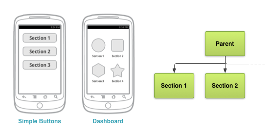
Figure 3. Example button-based navigation interface with relevant screen map excerpt. Also shows dashboard pattern discussed below.
A common, button-based pattern for accessing different top-level application sections, is the dashboard pattern. A dashboard is a grid of large, iconic buttons that constitutes the entirety, or most of, the parent screen. The grid generally has either 2 or 3 rows and columns, depending on the number of top-level sections in the app. This pattern is a great way to present all the sections of the app in a visually rich way. The large touch targets also make this UI very easy to use. Dashboards are best used when each section is equally important, as determined by product decisions or better yet, real-world usage. However, this pattern doesn't visually work well on larger screens, and requires users to take an extra step to jump directly into the app's content.
More sophisticated user interfaces can make use of a variety of other user interaction patterns to improve content immediacy and presentation uniqueness, all the while remaining intuitive.
Lists, Grids, Carousels, and Stacks
List and Grid List Design
For design guidelines, read Android Design's Lists and Grid Lists guides.
For collection-related screens, and especially for textual information, vertically scrolling lists are often the most straightforward and familiar kind of interface. For more visual or media-rich content items such as photos or videos, vertically scrolling grids of items, horizontally scrolling lists (sometimes referred to as carousels), or stacks (sometimes referred to as cards) can be used instead. These UI elements are generally best used for presenting item collections or large sets of child screens (for example, a list of stories or a list of 10 or more news topics), rather than a small set of unrelated, sibling child screens.
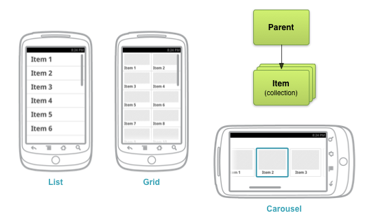
Figure 4. Example list-, grid-, and carousel-based navigation interfaces with relevant screen map excerpt.
There are several issues with this pattern. Deep, list-based navigation, known as drill-down list navigation, where lists lead to more lists which lead to even more lists, is often inefficient and cumbersome. The number of touches required to access a piece of content with this kind of navigation is generally very high, leading to a poor user experience—especially for users on-the-go.
Using vertical lists can also lead to awkward user interactions and poor use of whitespace on larger screens, as list items generally span the entire width of the screen yet have a fixed height. One way to alleviate this is to provide additional information, such as text summaries, that fills the available horizontal space. Another way is to provide additional information in a separate horizontal pane adjacent to the list.
Tabs
Tab Design
For design guidelines, read Android Design's Tabs guide.
Using tabs is a very popular solution for lateral navigation. This pattern allows grouping of sibling screens, in that the tab content container in the parent screen can embed child screens that otherwise would be entirely separate contexts. Tabs are most appropriate for small sets (4 or fewer) of section-related screens.
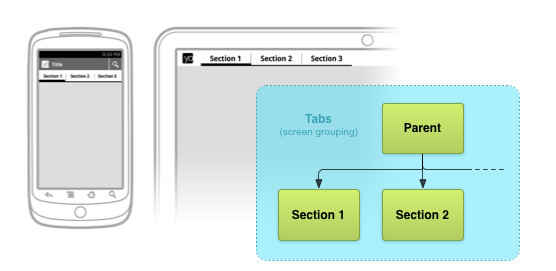
Figure 5. Example phone and tablet tab-based navigation interfaces with relevant screen map excerpt.
Several best practices apply when using tabs. Tabs should be persistent across immediate related screens. Only the designated content region should change when selecting a tab, and tab indicators should remain available at all times. Additionally, tab switches should not be treated as history. For example, if a user switches from a tab A to another tab B, pressing the Back button (more on that in the next lesson) should not re-select tab A. Tabs are usually laid out horizontally, although other presentations of tab navigation such as using a drop-down list in the Action Bar (pattern docs at Android Design) are sometimes appropriate. Lastly, and most importantly, tabs should always run along the top of the screen, and should not be aligned to the bottom of the screen.
There are some obvious immediate benefits of tabs over simpler list- and button-based navigation:
- Since there is a single, initially-selected tab, users have immediate access to that tab's content from the parent screen.
- Users can navigate quickly between related screens, without needing to first revisit the parent.
Note: when switching tabs, it is important to maintain this tab-switching immediacy; do not block access to tab indicators by showing modal dialogs while loading content.
A common criticism is that space must be reserved for the tab indicators, detracting from the space available to tab contents. This consequence is usually acceptable, and the tradeoff commonly weighs in favor of using this pattern. You should also feel free to customize tab indicators, showing text and/or icons to make optimal use of vertical space. When adjusting indicator heights however, ensure that tab indicators are large enough for a human finger to touch without error.
Horizontal Paging (Swipe Views)
Swipe Views Design
For design guidelines, read Android Design's Swipe Views pattern guides.
Another popular lateral navigation pattern is horizontal paging, also referred to as swipe views. This pattern applies best to collection-related sibling screens, such as a list of categories (world, business, technology, and health stories). Like tabs, this pattern also allows grouping screens in that the parent presents the contents of child screens embedded within its own layout.
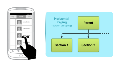
Figure 6. Example horizontal paging navigation interface with relevant screen map excerpt.
In a horizontal paging UI, a single child screen (referred to as a page here) is presented one at a time. Users are able to navigate to sibling screens by touching and dragging the screen horizontally in the direction of the desired adjacent page. This gestural interaction is often complemented by another UI element indicating the current page and available pages, to aid discoverability and provide more context to the user. This practice is especially necessary when using this pattern for lateral navigation of section-related sibling screens. Examples of such elements include tick marks, scrolling labels, and tabs.
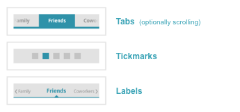
Figure 7. Example paging companion UI elements.
It's also best to avoid this pattern when child screens contain horizontal panning surfaces (such as maps), as these conflicting interactions may deter your screen's usability.
Additionally, for sibling-related screens, horizontal paging is most appropriate where there is some similarity in content type and when the number of siblings is relatively small. In these cases, this pattern can be used along with tabs above the content region to maximize the interface's intuitiveness. For collection-related screens, horizontal paging is most intuitive when there is a natural ordered relationship between screens, for example if each page represents consecutive calendar days. For infinite collections (again, calendar days), especially those with content in both directions, this paging mechanism can work quite well.
In the next lesson, we discuss mechanisms for allowing users to navigate up our information hierarchy and back, to previously visited screens.